

Fall 2023 Color Palettes for Graphic Designers
byTaylor Slattery| September 21, 2023

当树叶开始变红,信号常e of seasons, the tone of our graphic design efforts starts to shift as well. From Black Friday to pumpkin spice lattes, for designers, fall marks the start of a big push to drive Q4 sales. So, we decided to put together some dynamic Fall 2023 color palettes for graphic designers this season.
When the weather starts to cool down it’s not only time to break out the sweaters, but the fall color palettes as well. Fall has a very particular mood and as designers, colors are one of the most powerful tools we can use to capture some of those sorts of feelings it evokes. Whether you’re working on promotional material for clothing, events, or food and beverages, it’s a good idea to have a few fall color palettes in your back pocket to bust out when fall finally rolls around.

The Tried & True
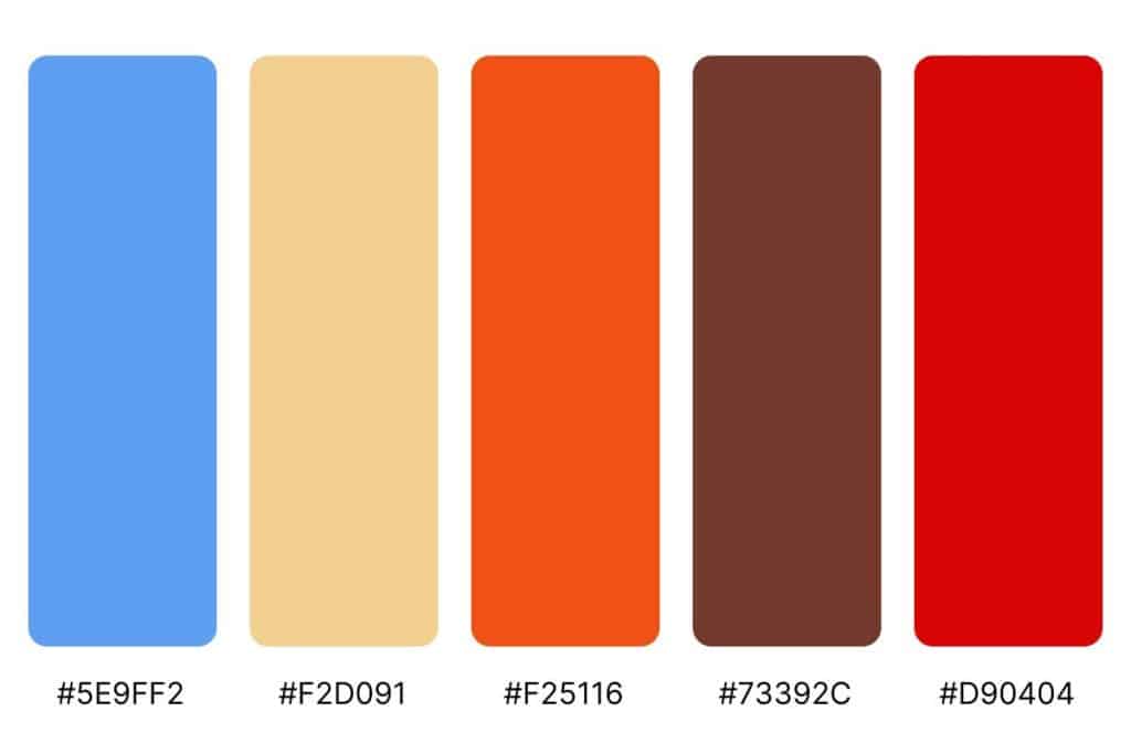
When most people think of fall, there’s a very specific palette that comes to mind. As the days get shorter and diminish the ability of trees to photosynthesize, leaves begin to shift in color from a healthy green to shades of yellow, orange, and red. Let’s leverage those natural connotations people already have and expand the palette a bit further by introducing some blues and greens.
The key here is to focus on saturation and value. This same palette could very easily read as summer if we lighten the value and desaturate it a bit to give it a sort of under-the-sun type of vibe. By darkening their values and giving each color a similar level of saturation, we end up with a flexible, unified mix of warms and cools.

A Hint of Blue
This palette actually isn’t too far off from the general fall palette most imagine, yet notice how fresh it feels. This is what’s known as a split complementary color scheme. The bulk of the standard fall palette lives in those deeper, darker warm tones—saturated browns, oranges, and reds.
By introducing blue, which lives on the opposite side of the color wheel, we add an accent that plays nicely with our existing base, while introducing some contrast and visual interest. The lighter beige gives us some additional flexibility in terms of contrast for type usage when paired with the darker tones found elsewhere in this palette.

Something’s Brewing
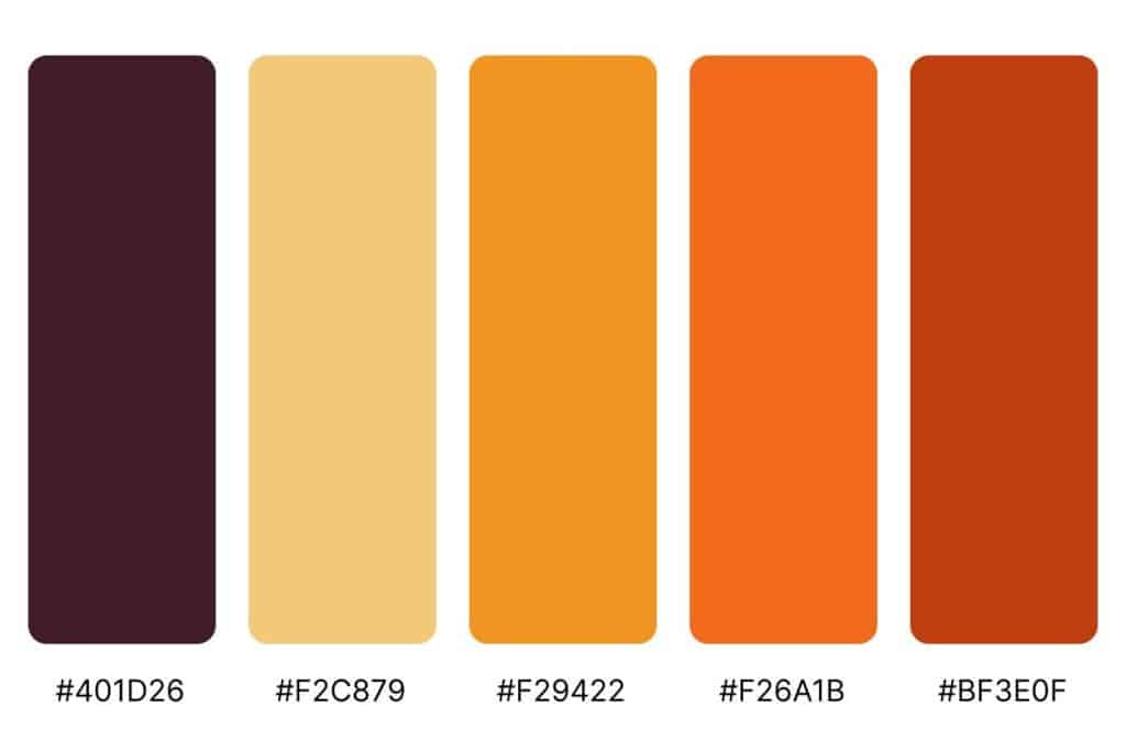
What would fall be without Halloween? Orange and black are Halloween staples, but you don’t have to limit yourself to their most in-your-face versions to capture the same mood. Substituting a deep, warm brown in place of black can take the edge off and help you avoid the “Spirit Halloween” look.
Desaturating the orange to move it away from high-vis vest territory and pairing it with some neighboring warm tones creates a harmonious Fall palette you can use in a variety of situations—not just for Halloween.

Color Palettes Are Never Out Of Season
Whether you’re a photographer, product manager, graphic designer or a digital marketer, it’s always worth having a reliable selection of color palettes in your back pocket.
If you want togain professional experience as a graphic designer, Sessions College is the right choice for you. With fully remote,100% online degreesandcertificate programs, Sessions is helping to build up and prepare students for dynamic, creative careers as the next generation of graphic designers.
Taylor is the Managing Editor of Notes on Design. Taylor is a graphic designer, illustrator, and Design Lead atWeirdsleep.
If you are interested in learning more about using color, Sessions College offers aColor Theory courseand many othergraphic design coursesfor students at all levels. ContactAdmissionsfor more information.
Recent Articles


NoD Newsletter
Enhance your inbox with our weekly newsletter.